
PROGRAMS
UI&UX Design
Time
DESCRIPTION
Fall 2021
The TigerSafe app is designed to make your experience on campus as safe and satisfying as possible. TigerSafe empowers you with the tools you need to be prepared, mitigate dangers, and respond appropriately to situations that occur.
The app includes emergency alerts, tools for staying safe on campus, emergency response guides, campus maps, and a variety of health and wellness resources.
Developed by Environmental Health & Safety in partnership with Public Safety, TigerSafe is Princeton’s official health and safety app for the campus community.
Tiger Safe
Summary
goal
Information
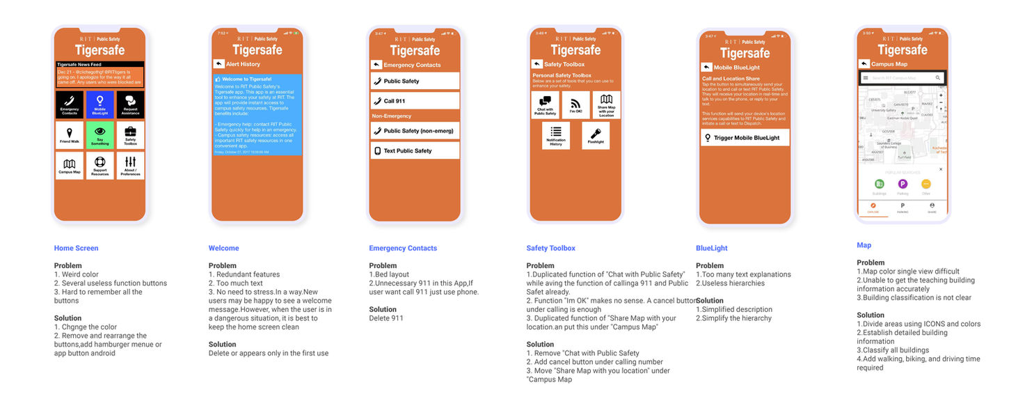
The homepage information is not delivered properly, I cannot understand what "say something" is about.
Features
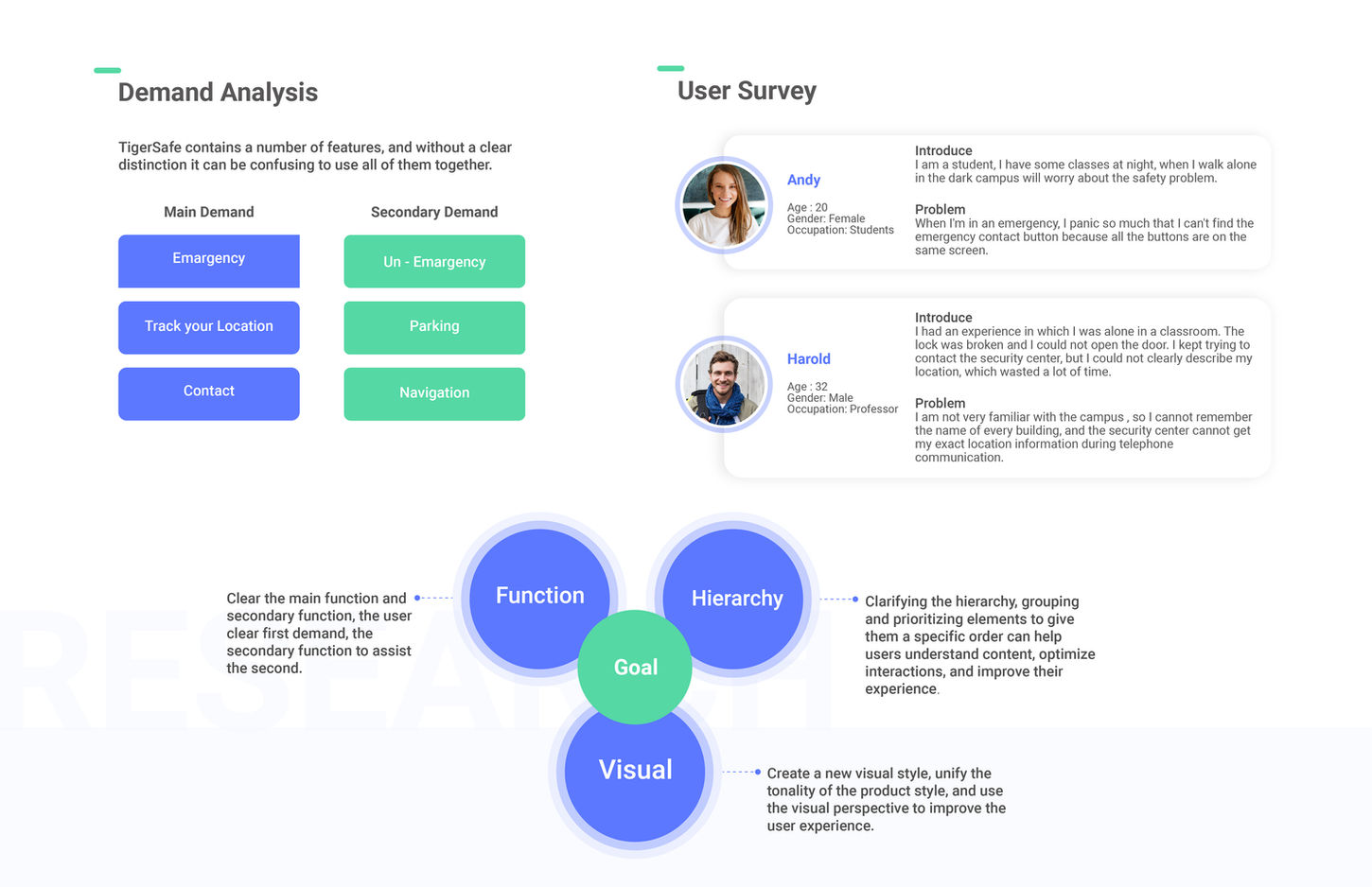
There are too many features on this app that students may never use, Many features are not clear to the user.
Design
Inconsistent design includes:icon,font,color,layout.
Emergency
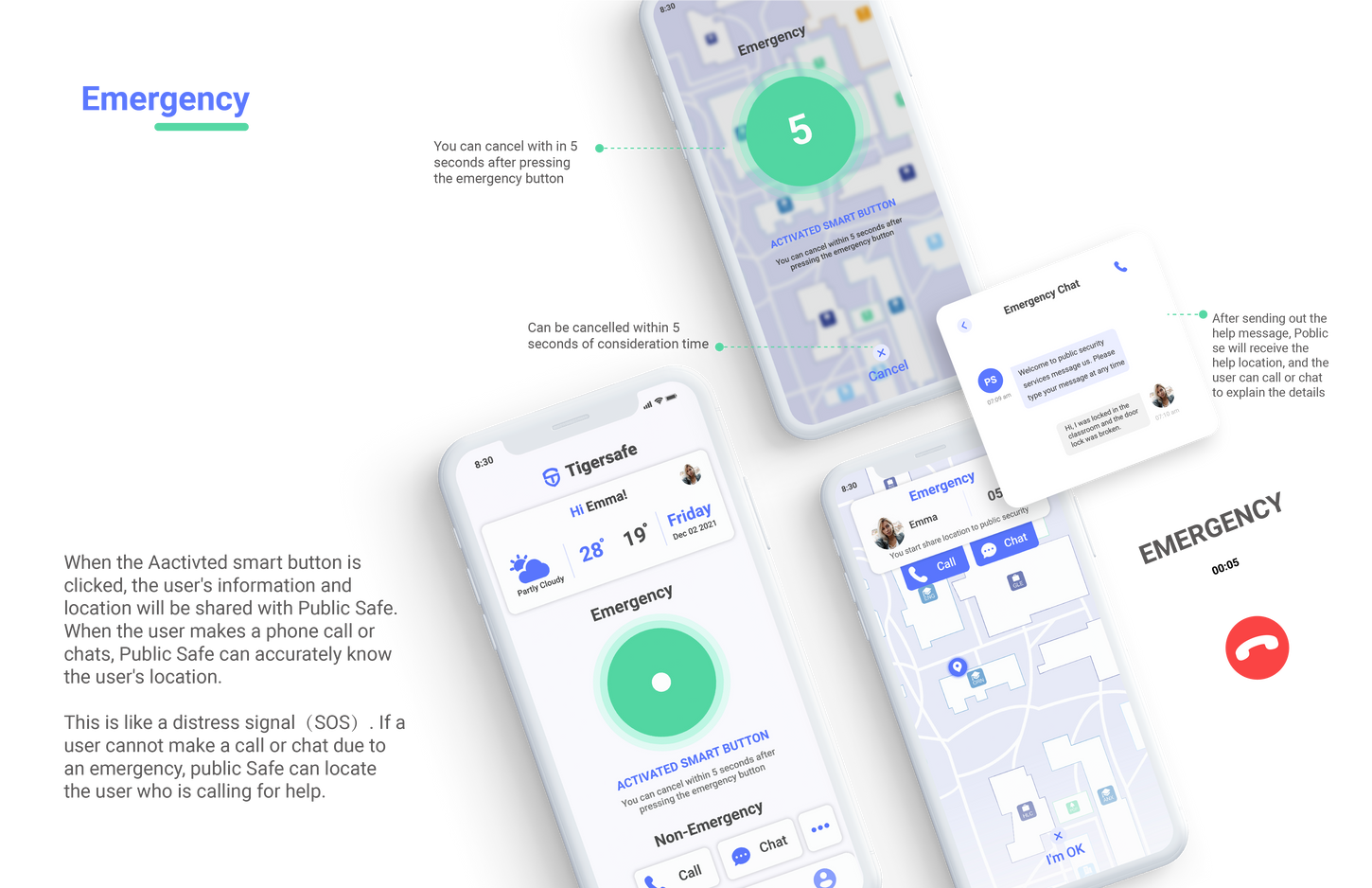
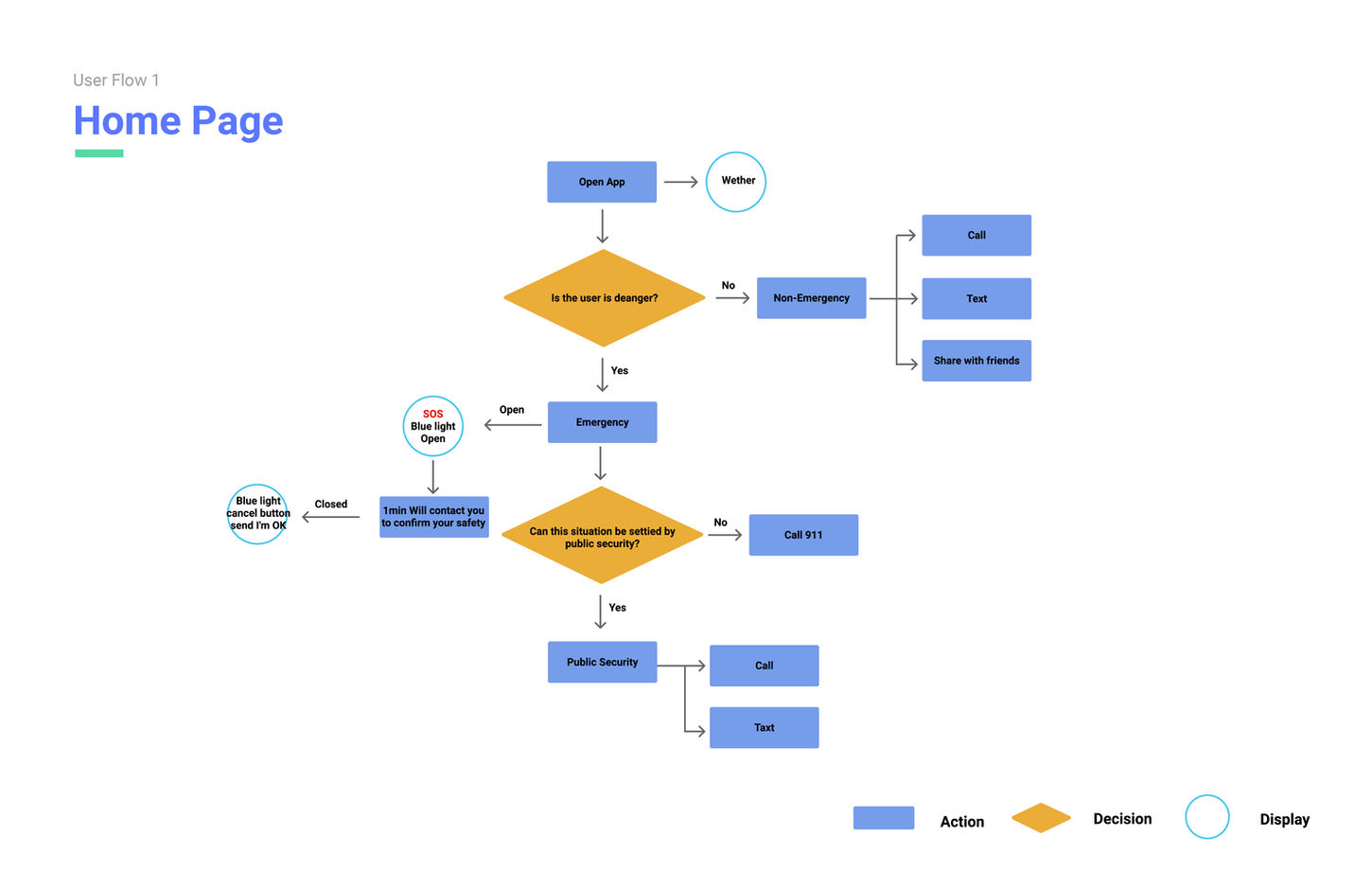
Emergency function,clear message delivery,clear hierarchy,organize all information into a hirtarchy
Text
Reduce descriptive text and use icons to facilitate user rearding
Hierarchy
There is no clear hierarchy, all the buttons are of the size that is figured out, although there will be color distinctions, I can't judge which one is the most important information.
Irreversible
Confusing interaction structure, part of the page is irreversible.
Direction
When entering the next page, there is no clear direction, and the user is lost in the App.
Design
A design icon, font, colors, and layouts.
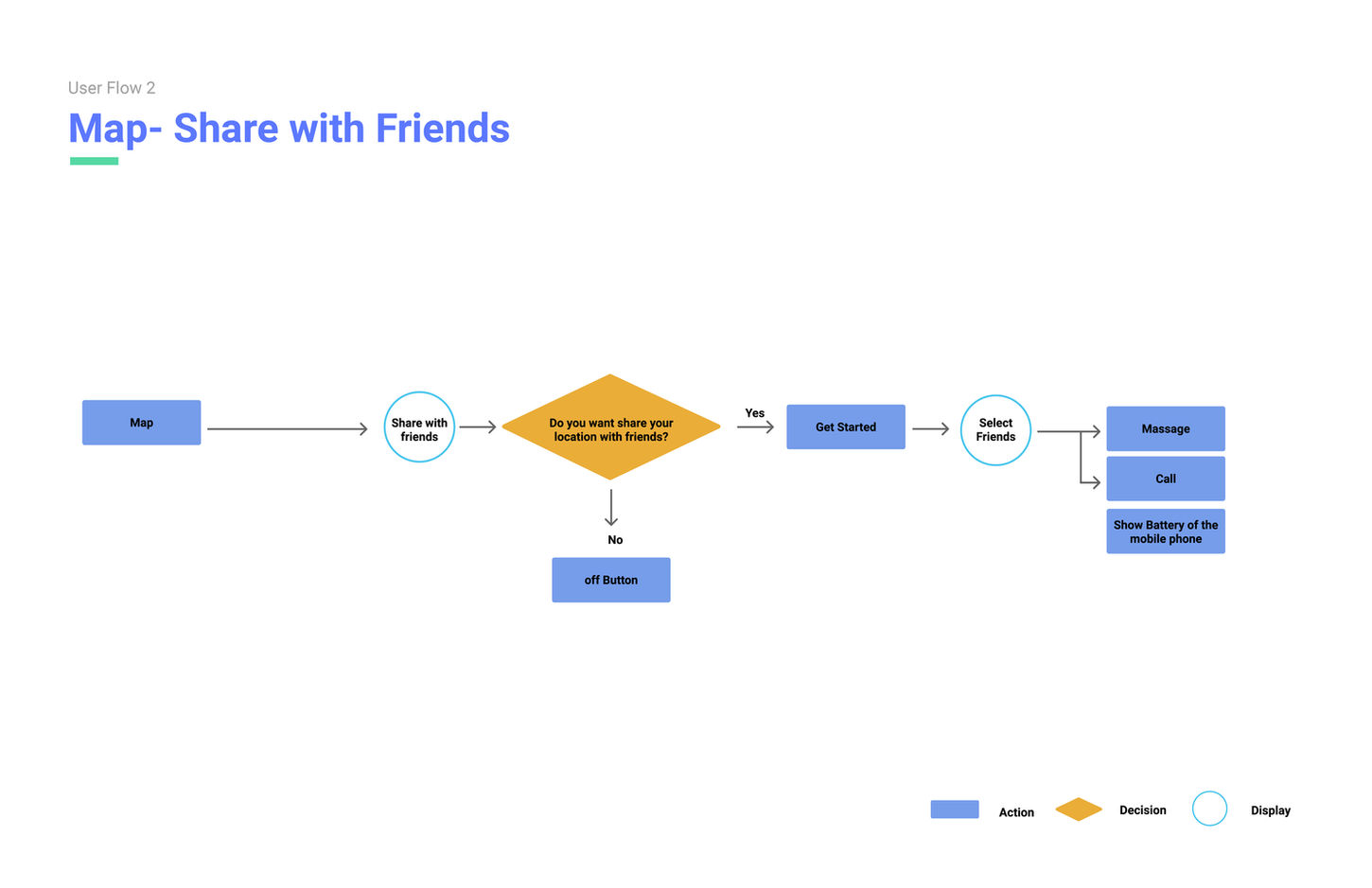
Share with friends
Add map and friends sharing function, simplify the sharing function, simplify the sharing process.
Content analysis




thank you


